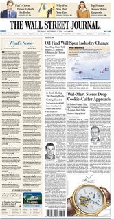
Design: New Slimmer WSJ
Last one month has seen a redesign of some well-established mastheads. (Very interesting for me as I am also working on a relaunch issue)
1) La Tribune, a Paris financial daily, relaunched in early november with a Garcia Media-led design. Apart from content reorganisation, new typographic fonts—Gotham Bold for the new logo; Miller for headlines and Guggenheim in various weights define the new look. The design also features innovative advertising configurations.
 2) The Times of London adopted a new typeface 'Times Modern' and a redrawn insignia along with other design changes under the supervision of Neville Brody
3) The new-look slim WSJ in consultation with Mario Garcia is next. From Jan. 2, 2007, The Wall Street Journal will shave three inches from the width. The new front page will have five columns instead of six. A 48-inch width will make the paper more convenient to hold and carry. New, easy-to-read typography, improved labeling, more prominent headline styles, innovative summary boxes, and advanced infographics are some of the changes readers can expect.
To read more about WSJ redesign, visit dowjones pressroom
To know more about the other two redesign, visit newsdesigner.com
Labels: Design


0 Comments:
Post a Comment
<< Home