Newspapers: How Telegraph.co.uk became visually closer to print after relaunch
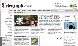
Europe's oldest online newspaper Telegraph relaunched on May 9, with a cleaner white look, wider front page and the reappearance of the paper's traditional logo in the site masthead.

The left-hand navigation has been slimmed down and incorporates services like podcasts; a breaking news ticker has also been added and the home page contains just one advertisement. The website has been redesigned in response to suggestions from reader focus groups and more closely resembles the print edition.
The edit team's writeup about the redesign process How we redesigned our front page has some interesting insights into the differences in approach between web and print designers.
Labels: Newspaper


0 Comments:
Post a Comment
<< Home