Reaching Young Readers
A new initiative by MPA gives free digital editions of magazines to college students hoping to convert them into magazine readers and to test the viability and popularity of digital delivery. Five publishers are participating in this initiative. Read more

Ideas archive

World's First Mag
The Gentleman's Magazine was the first general-interest magazine. It was founded in London by Edward Cave in January, 1731. The original complete title was The Gentleman's Magazine: or, Trader's monthly intelligencer. More>>

More Facts

30 YEARS
Merrill Lynch report on the state of the newspaper industry does not see online representing over 50% of total newspaper ad revenues until more than 30 years from now.More>>

More Numbers
  • ASME's Top 40 Magazine Covers
  • 30 Most Notable Launches of 2005
  • Talking Magazine Videos
  • An Illustrated History of Magazine Covers and Cover Lines
  • Magazine First Issue Archive
  • Poynter
  • Folio Magazine
  • Magazine Publishers of America
  • American Society of Business Press Editors
  • Mr Magazine
  • Beyond the Page
  • Designing Magazines
  • NewsWatch India
  • Free Newspapers
  • The Editors Weblog
  • FishBowl NY
  • International Magazine News
  • Newspaper Index Blog
  • MagCulture
  • Magazine Daze
  • Magazine Enterprise 360
  • Online Press Gazette
  • Magazine Symposium 2007
  • Magazine Literacy
  • Magazine death blog
  • Premiere Issues Project


  • Global Voices Online - The world is talking. Are you listening?

    Magpie

    Why Magpie? Because I like observing these sleek birds with a tapering tail. And like Magpies, I live with the burden of being a 'chatter', even though I believe that I am rather shy, reserved and unobtrusive :).

    Friday, September 29, 2006

    Publishing: 5 Steps to Publishing Nirvana

    Robert Sacks, a consultant to the printing/publishing industry and president of The Precision Media Group has a word of encouragement for publishers in his article: 5 Steps to Publishing Nirvana:
    "Have no fear about your chosen profession. The process of information distribution is not going to go away. Indeed, it is accelerating at an unprecedented rate. What you need to consider is the true value of your information to the general public and the process by which you distribute this knowledge.

    Five easy steps to publishing nirvana:
    1 Who is my target audience?
    2 Where is my targeted audience?
    3 What is the real value of my edit (information) to that audience?
    4 What is the most efficient method to reach the maximum targeted audience?
    5 How do I keep my information valuable and fresh for my targeted audience?

    These may seem like simple concepts on the surface, but they are not. On the atomic level, it can all be distilled down to the simple equation of RV = RP or, for the laymen, real value equals real profit. In this era of abundant information, is your edit of any real value? If so, how valuable is it? If it is valuable, to whom is it valuable? This is where the concept of niche comes into play. ...

    Read the entire article on pubexec.com

    Labels:

    Tuesday, September 26, 2006

    Future: Onscreen Reading that feels like Print

    This month The New York Times announced a stand-alone digital reader modeled on the printed newspaper. Developed jointly by the New York Times Company and Microsoft, the Times Reader uses Microsoft's new Windows Presentation Foundation technology and is available as beta software here. Times Reader attempts to provide an onscreen reading experience that is as familiar as the printed page, only more versatile and interactive.

    The reader is expected to give newspapers and magazines a new alternative to digital publishing with the look and feel of the print. You can use any screen size or font size and the layout will automatically adjust itself to the size of the screen.

    According to an article on Wired.com, those who have previewed the Times Reader find that on screen, artwork and photography run within the text as integral elements, not as floating afterthoughts. Navigation options are more paperlike than weblike; even the Times' proprietary body font has been ported over. The Navigation is impressive. Stories are presented clearly and with priority; artwork aids both design and context. Section heads are customizable, and clicking on them feels as natural as thumbing through the paper on the subway.

    Both the application and the content are stand-alone. The Reader doesn't need to be constantly connected; the entire newspaper can be downloaded either according to a preset schedule or at the user's request.

    Take the Times Reader
    Tour
    Wired.com article:
    Old Gray Lady Dons New Clothes

    Labels:

    Saturday, September 23, 2006

    Design: Magazines as a Showcase

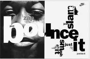
    Will we ever see layouts like this in our magazines?


    India’s magazine industry is seeing a boom, a couple of magazine launches are announced every month. Yet it is rare to spot writing that impresses and editorial design that inspires!

    What is wrong? In a race to meet the deadlines we have forgotten that while readers need information, insight and entertainment, they would appreciate content in an intelligent and aesthetically-pleasing package. Editorial pages must have elements that are not just another sidebar, quote box, visual or a mundane type cluster. Visual appeal and intelligent writing is important for magazines to endure.

    One magazine professional I highlighted this to brings out b2b publications and he could not be bothered by lack of design. His excuse: “Our readers are used to such bad design that the absence of qualified 'designers' in the 'design' team does not matter.” Another does not even realize that their layout is victim of template-isation and poor usage of graphics downloaded from free sites or culled from ubiquitous FREE design libraries.

    Two weeks ago I had the fortune to be part of a huge audience listening to eminent names in design: Andy Altman, Peter Bilak, Neville Brody, Paul Hughes, Nick Bell brought to India as part of Kyoorious Design Yatra in Goa ... and the experience was humbling. Most of the international speakers at the conference were accomplished designers who at sometime in their professional life were involved in magazine design and each spread/layout they displayed showed amazing thought.

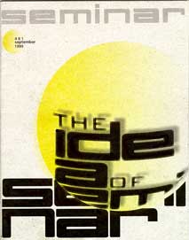
    In contrast, the Indian speakers at the conference had design/ advertising background. Only magazine that was represented there (as an industry exhibit!) was Seminar which for long has had beautiful covers done using type, each one distinctive and very attractive.

    Magazines have an amazing opportunity to be a showcase for good design unlike advertising which at the end of the day has to sell a product or a service.
    But for most magazines in India, it is a bus we have missed.

    Labels:

    Tuesday, September 19, 2006

    Newspaper: UK's 'The Independent' in New Delhi

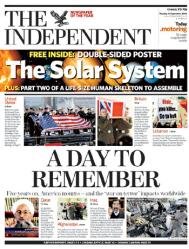
    The Independent has announced plans to publish in India, making it the first British newspaper to be printed on the subcontinent. Pending government approval, it will be brought out by Jagran Prakashan, India's largest newspaper company, in which its parent company, Independent News & Media plc (INM), has a 20.8 per cent stake.
    The Indian edition will be aimed at the high end of the local market, plus the leading hotel groups and embassies, mostly around the major cities, with estimated sales of 5,000 copies a day.

    Read more: New Indian edition planned for subcontinent

    Labels:

    Friday, September 15, 2006

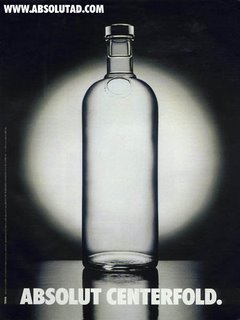
    Advertising: Absolut-ly Successful Magazine Ads

    If you’re a publisher looking for a solid print champion, Absolute Vodka is worth toasting according to "Latest from Min' newsletter. Even as its competitors began to shift to television advertising, Absolut stuck to its print platforms through 25 years before making its television advertising debut earlier this year. Tim Murphy, Absolut’s brand director, says he prefers magazine brands when he needs a direct, effective ad vehicle to reach his target audience, “Once we figure out who are target is—and we know in quite quiet a bit of detail who they are—magazines afford us the opportunity to pinpoint those people and reach out to them.”
    Murphy’s Message to Magazine Publishers
    “Publish a magazine that’s popular and appealing to the interests of our consumer. We’re not interested in value-added opportunities or inserts unless the magazine is right for our target. The best thing magazine publishers can do is listen to us. There’s a tremendous amount of consolidation in the beverage alcohol industry, so any one supplier might not have a direct match between brand X and magazine Y.”

    Example of Absolute’s Personalized Messages aimed at Specific Magazine Audiences:


    Absolut Centerfold for Playboy : Absolut created an Absolut Centerfold with a bottle without any text on it but with an accompanying “playmate data sheet” complete with things like “the perfect night: at home with my closest friends, Sven, Björn, Ingmar, while jumping back and forth between the sauna and ice baths….”

    Absolut Image and Absolut Exposure for the Annual issue of Canadian Geographic: Absolut Image is an overlapping montage of photos showing parts of some Absolut Vodka bottles. The center “photograph” with the Absolut shape cut-out shows the image of an endangered Rocky Mountain Grey Wolf.

    Absolut Fan: This ad is classic magazine ad but almost 2/3 of the ad torn off. It looks like some Absolut fan tried to tear this ad off the magazine.

    -----------------------------------------------------------------------
    Librarians have to guard their magazines from being de-Absoluted"

    Richard W. Lewis, author of Absolut Book: The Absolut Vodka Advertising Story

    Labels:

    Wednesday, September 13, 2006

    Trends: The Economist Effect

    The Christian Science Monitor has an interesting article on what it calls the ‘Economist Effect’. Here are some excerpts:

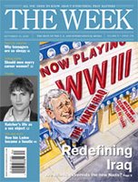
    1) Since 1988, Time's circulation has fallen by about 13 percent. US News & World Report has also dropped by about 13 percent. Newsweek, meanwhile, has lost about 6 percent of its paid readership. But during that same time period, other titles have thrived. Take The Economist. The British news weekly has seen its circulation jump by about 300 percent, despite the fact that it is less flashy, more serious, and costs more than twice as much as its US counterparts. And since its launch in 2001, The Week*, a new kind of Reader's-Digest-type summary of news accounts from other organizations, has attracted 439,000 readers.

    2) Time's new publishing schedule will mean it hits the streets on the same day as its British competitor. And Time's idea about circulation, placing less emphasis on quantity, suggests an approach that several publications, including The Economist, have pursued: It's not how many subscribers you have; it's who they are.

    3) Among newspapers, the rise of the elite media (media that target better educated, more-affluent audiences with more money to spend) can be seen in the growing and increasingly nationalized circulations of The New York Times and The Wall Street Journal. On radio, it can be calculated in the increase of National Public Radio's audience. In magazines, the prime example is The Economist.

    4) As wealthier, more news-focused audiences leave mainstream outlets, those outlets will be forced to reach out to different groups to fill the holes in their audience - groups that probably have lighter definitions of news. In other words, a small group of coverage-rich news media will get richer while the rest get poorer in their content.

    For complete article, read: The Economist effect: Not all news media are dumbing it down

    * Not The Week, brought out by Malayalam Manorama Group

    Labels:

    Sunday, September 10, 2006

    LaunchPAD: Kyoorius Design Magazine

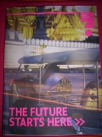
    Kyoorius design magazine launched yesterday at the Kyoorius Design Yatra in Goa. The inaugural issue has about 96 pages and is themed: The future starts here. 13 design studios from across India have shared their views on ‘What is Design' in this issue.
    On a larger note this quarterly, edited by Rajesh Kejriwal, aims to cover Indian design scene and provide designers a platform to showcase and share their work in a hope to bring about a positive change on the Indian design scene.

    (Sorry about the bad photo, the magazine really does look good)

    Labels:

    Monday, September 04, 2006

    Special Interest: Magazines for Children

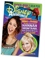
    Walt Disney India and Infomedia India plan to launch 'Disney Adventures' for children in India with the October issue. The first issue, features content related to the popular Bollywood movie 'Krrish', Disney movies, jokes, comic pages, gaming zones, computer and gadget write-ups, fashion, contests. Disney Adventures India will be a monthly with about 100 pages.

    If you are an ardent magazine reader and are looking for a good magazine for your child, you might want to consider Highlights for Children. Lotus Learning Private Limited brings this internationally-acclaimed publication to Indian kids at a subscription price of Rs 990 for one year. You have to request for the magazine by writing to their office in Mumbai (Lotus House, 512 SV Road, Bandra (W), Mumbai-50). Manorama Group too brings out an English weekly magazine for kids called Magic Pot. You can subscribe at their group website.

    --------------------------------------------------------

    It is sad that children’s publication Target (living Media product) shut down years ago. It was my introduction to how much fun magazines can be...
    PS: Does anyone miss Chandamama?
    --------------------------------------------------------
    Related Stories:
    1) Article: Remembering 'Target' and 'Detective Moochwala'
    2) Agencyfaqs story on proposed launch of Disney Adventureshere