Reaching Young Readers
A new initiative by MPA gives free digital editions of magazines to college students hoping to convert them into magazine readers and to test the viability and popularity of digital delivery. Five publishers are participating in this initiative. Read more

Ideas archive

World's First Mag
The Gentleman's Magazine was the first general-interest magazine. It was founded in London by Edward Cave in January, 1731. The original complete title was The Gentleman's Magazine: or, Trader's monthly intelligencer. More>>

More Facts

30 YEARS
Merrill Lynch report on the state of the newspaper industry does not see online representing over 50% of total newspaper ad revenues until more than 30 years from now.More>>

More Numbers
  • ASME's Top 40 Magazine Covers
  • 30 Most Notable Launches of 2005
  • Talking Magazine Videos
  • An Illustrated History of Magazine Covers and Cover Lines
  • Magazine First Issue Archive
  • Poynter
  • Folio Magazine
  • Magazine Publishers of America
  • American Society of Business Press Editors
  • Mr Magazine
  • Beyond the Page
  • Designing Magazines
  • NewsWatch India
  • Free Newspapers
  • The Editors Weblog
  • FishBowl NY
  • International Magazine News
  • Newspaper Index Blog
  • MagCulture
  • Magazine Daze
  • Magazine Enterprise 360
  • Online Press Gazette
  • Magazine Symposium 2007
  • Magazine Literacy
  • Magazine death blog
  • Premiere Issues Project


  • Global Voices Online - The world is talking. Are you listening?

    Magpie

    Why Magpie? Because I like observing these sleek birds with a tapering tail. And like Magpies, I live with the burden of being a 'chatter', even though I believe that I am rather shy, reserved and unobtrusive :).

    Wednesday, January 20, 2010

    Video: 2000-2010 through Magazines Covers

    Magazine Publishers of America and the American Society of Magazine Editors have put together an amazing video that tells the story of the last decade (2000-2010) through 92 iconic magazine covers.

    Labels:

    Tuesday, February 03, 2009

    Ediorial: Esquire Feb 2009 cover-Innovation or a Threat to Editorial Integrity?

    The February issue of Esquire blurs the boundary between advertising and editorial in new ways: right in the middle (see on Obama's shoulder) of the cover is a window, or peel-back flap with an invitation to “Open here”.

    Opening the window reveals quotations from articles inside the issue and an advertisement for “One Way Out,” a new series on the Discovery Channel cable network. Those who leave the window unopened do not see the ad or the quotations.

    New York Times reports that the concept was the brainchild of the editor-in-chief of Esquire, David Granger. “Everybody keeps talking about how print is an old medium. It is an old medium, but it doesn’t mean it’s a wrung-out medium or a tired medium,” Mr. Granger said to NYT.

    However, the 'flap' cover issue has sparked much debate and is being viewed as being in contravention of guidelines put forth by the American Society of Magazine Editors (ASME). ASME has invited David Granger to justify himself before his peers at a member's lunch (Feb 24) where the proposed topics of discussion is: "Is the cover window on the Obama issue of Esquire an exciting print innovation -- or a threat to editorial integrity"

    Labels:

    Thursday, January 10, 2008

    Article: The Quest for the Perfect Cover

    Jan White’s* article ‘The Quest for the Perfect Cover’ in Publishing Executive nicely sums up the various roles of a magazine cover and how editors/publishers can judge the effectiveness of the cover they are planning to release. (Extract follows)

    No matter what you put on the cover, keep the six functions of covers in mind:
    1. Familiar recognition from issue to issue (that's the brand)
    2. Emotionally irresistible (that's the image's appeal)
    3. Arousing curiosity (that's to pull the casual glancer in)
    4. Intellectually stimulating, interesting (that's to promise benefits)
    5. Efficient, fast, easy to scan (that's showing off the service)
    6. Worth the investment of money and time (that's the "What's in it for me?")
    Four ways to judge your cover:
    1. Covers are the prime sales tool that must be judged realistically both for content as well as form. Never trim a printout, mount it beautifully, and display it with its alternates on the finely polished surface of the conference-room table.
    2. Instead, ask the designer to print out all the alternates as hard copy, trim them accurately to magazine size and glue them onto old issues, so you can see them as close to the real thing as possible. Now, toss them on a tabletop, so they flop around and overlap like real magazines do.
    3. If you can spare the time, go to the local drugstore or bookstore, and sneak your upcoming issue in among the other magazines on the racks. Does it hold its own or does it disappear?
    4.If selling on newsstands is not your problem, but competition among executives is, gather copies of what your targets might be reading, including your competition, of course. Mock up an executive's in-box or tabletop arrangement in some way, and place yours among them. That is the realistic way to judge your cover. Keep that still-life stack for next month's headaches.

    *Jan White is the author of the book, "Editing by Design" and lectures worldwide on the relationship of graphic design to editing.

    Labels: , ,

    Thursday, December 13, 2007

    Awards: Cover of the Year 2007

    MPA's Cover of the Year award 2007 goes to September 11, 2006 cover from The New Yorker.


    About the cover:
    For the five-year 9/11 anniversary cover, John Mavroudis’ concept was to stay away from the surfeit of images that recall the horror and remember the wonder of Philippe Petit’s 1974 tight-rope walk between the towers. The result in Owen Smith’s painting is magical: the walker, in the absence of towers and rope, remains suspended in the white space of a blank page. The two-part cover (a first for The New Yorker) is a memorial to the spirit of humanity and those who died there, and especially to the man who did a perfect dive as he plunged to his death.

    You can see winning covers and finalists, and read the stories behind them here.

    Labels: ,

    Wednesday, October 17, 2007

    Redesign: Newsweek and BusinessWeek

    Business Week and Newsweek are sporting new looks this week. Quotes from the people behind the redesign:
    Jon Meacham, Editor, Newsweek:
    “Some people in our business believe print should emulate the Internet, filling pages with short, Weblike bites of information. We disagree. There is a simple idea behind the changes in the issue of Newsweek you are holding: we are betting that you want to read more, not less.”

    Business Week's Bruce Nussbaum:
    “We’re introducing this type of open source aggregation into the new magazine, with blog items, quotes, and content from unusual, global sources surrounding stories, sometimes enhancing them, sometimes disagreeing with them. It’s a conversation, not a lecture."

    In an interesting twist, Minoline invites magazine professionals to test "How ‘Redesigned’ Are These Recent Major Magazine Redesigns?

    Labels: ,

    Monday, October 15, 2007

    Editorial: Covers that Sell and Covers that don't

    The just-published 'Min’s Most Intriguing & Top Selling Magazine Covers' highlights the past few years' most interesting, intriguing, best selling and worst selling covers.
    Also has editors' and publishers' picks and musings on their favorite feature stories.
    You can order your copy here .

    Labels: ,

    Thursday, October 04, 2007

    Design: Book 'Editorial Design'

    This book covers the design of magazines and newspapers for a wide variety of markets. Generously illustrated and including case studies, practical tips, examples of best practice and profiles of individual designers, the book explains the fundamentals of editorial design and layout.
    Written by Yolanda Zappaterra, a regular contributor to Design Week, Grafik and Time Out, the book shows how and why editorial design is its own discipline, differing from other areas of graphic design.
    Subjects covered include branding, how to create layouts, handling copy and images, design and production skills and trends in editorial design.
    Read more here

    Labels: ,

    Monday, September 24, 2007

    Editorial: Five Faces of Femina

    In preparation of its fiftieth anniversary in 2008, the October 10, 2007 issue of Femina will be sold with five distinct covers.

    This is a part of the two-fold activity undertaken to boost sales. Firstly, ‘Femina’ generated curiosity amongst its readers by conducting a poll on the '50 Most Beautiful Women in India' today, giving interested voters a list of 100 famous women of Indian origin.

    This was followed by an SMS activity, inviting readers to nominate their choice of women. The magazine website www.femina.in, also carried an option for visitors to take part in the poll. Ads in ‘Mumbai Mirror’ completed the marketing effort on this. Once the results were compiled, they found their way into the October 10 issue.

    Next, ‘Femina’ decided to take up the top five Most Beautiful Women (Aishwarya Rai, Bipasha Basu, Preity Zinta, Priyanka Chopra and Dipika Padukone) and create five cover pages – one each for these five.

    Original source link: agencyfaqs.com

    Labels: ,

    Thursday, September 13, 2007

    Editorial: Alternative Story Forms

    Finally a Study that proves what most editors and visual journalists have always believed. :)

    According to Poynter.org, 'Alternative Story Forms' or tools like a timeline, a checklist, a fact box or a graphic—that are not part of the standard model of most newspaper or magazine narratives- are a good way to engage a reader’s attention.

    As part of the Study readers were given one of six different versions (three print shown in the accompanying pciture and three online) of a story about bird flu. Each version included identical information fact for fact, but the design and story structure differed. When a reader finished reading one of these prototypes for five minutes, he or she answered questions about the story.

    It was found that of the three print versions of the prototypes, the most visually graphic version (No. 3) resulted in the most correct answers and established that alt story forms helped readers remember facts presented to them.

    Visit the original Source link to see the bigger version of six prototypes and more outcomes of the study.

    Labels: ,

    Thursday, April 19, 2007

    Editorial: Two Style Guide Resources

    Here are two valuable resources for editors.

    For a free download (PDF or Word) of Guardian Style Guide 2003, click here.
    The Economist Style Guide is available online for instant check whenever you have a usage doubt. In case you want a more expanded version of the Guide, you can buy the hardback version of Style Guide, which also featuures a special section on American and British English, a 64-page fact checker and glossary.

    For those interested in seeing how 'Style' has evolved over the years, there is the 1928 Style Guide from Manchester Guardian put together by CP Scott and used by The Guardian till 1960.

    Know more Style Guide resources?

    Labels: ,

    Monday, February 19, 2007

    Editorial: The Versatile Sidebar

    I have spent the entire day looking at ways to update links that show my website categories in the sidebar (archives by subject) which has become redundant after I updated to new blogger:( Interestingly, sidebar is one element from Print that is omnipresent online. (Also used on this site to provide easy access to archives, links to my other blog, to list our some links, etc)
    It was about 10 years ago, that I was introduced to sidebars. Though layouts have become very dynamic since, sidebars still continue to show up, especially in the front section of various magazines. If you are new to sidebars, here are some common ways to use sidebars in your articles.
    1) Provide ‘You too’ angle: Use Sidebars to relate to the reader directly. If you are profiling a successful business person, a sidebar could contain some general information on how you can set up your own business.
    2) Sidebars can profile specifics or provide local angle. This is often seen in those Indian titles that have content licensing agreement with international publications. India angle is sometimes provided through a sidebar!
    3) Use them to add late-breaking information to your article.
    4) Timelines also make good sidebars and show the story in context—how it all began, and how we arrived at this situation. (Though, I feel timeslines work best running through the double spread on top or at the bottom).
    5) Highlight one person’s view, usually a minority opinion, on the topic.
    6) Highlight case studies/personal stories to support your article.

    Since, sidebars are expected to aid readership of your story, here are some do's and don'ts
    1. Place sidebars along the main story. Never at end.
    2. Content should self contain, not depend on main story.
    3. Body type and colour can vary.
    4. Heads should be direct, simple, even labels (as shown in the example from Better Photography here).
    5. Visually, they provide contrast.

    Still want to know more? Refer to 'The Many Uses of Sidebars' in FOLIO:

    Labels:

    Monday, November 27, 2006

    Editorial: Narrative Cover for New Yorker

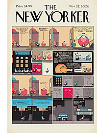
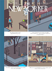
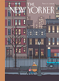
    Last week, The New Yorker magazine introduced what it calls the “the narrative magazine cover”. The Thanksgiving issue, (dated November 27, 2006), of the magazine was released with four covers on the newsstand with each image depicting a Thanksgiving scene, two set in 1942 and two today. The stories become intertwined in a fifth installment, a comic strip that will appear on the magazine’s Web site.


    What is interesting is that this five-part cover very innovatively melds the two mediums—print and online—elevating the magazine's cover to creative art. All five components are done by cartoonist Chris Ware, whose graphic novel Jimmy Corrigan: The Smartest Kid on Earth, has been called ‘the first formal masterpiece of [the] medium’.

    Although some magazines often use different covers of a single issue to spur collectors and fans to purchase extra copies of an issue, MediaPost writer Tom Siebert suggests that the strategy has never been used as segments in a single, continuing narrative.

    For the cartoon issue ‘The New Yorker’ set up a special print and distribution run that would guarantee that all geographic regions of the country would receive all four covers. Delivery packaging also worked to place all four covers successively in stacks, so that even two subscribing neighbors in an apartment building stand a good chance of getting different covers!

    Related Links:
    View the four covers and the concluding comic strip
    New Yorker Makes History: 4 Covers Tell One Cartoon Tale
    Editorial: When Readers see Double on the Newsstand

    Labels:

    Wednesday, October 04, 2006

    Editorial: When Readers see Double on the Newsstand

    To catch a reader on the newsstand, you get less than a second from distances of 3-6 feet. Split covers (running different covers of the same issue) are one of the many techniques publishers can use to get more publicity for their titles and to increase newsstand sales.
    Though a split cover may not always translate into increased newsstand pick-up, there are many valid reasons to try it—to test which subjects play better geographically; to illustrate an editorial concept; or to generate a publicity buzz at minimal cost.
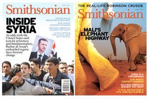
    When in July 2005, Smithsonian featured its first split cover (shown here) in 35-years, the goal was equally to boost paltry single-copy sales and to convey to prospective readers “this is not your grandmother’s Smithsonian.”

    The newsstand version featured “Inside Syria,” a story on the country’s mounting pressure to conform to international ideologies. The subscriber copy featured the less topical “Mali’s Elephant Highway.

    Split covers are increasing popular in the West. Years ago, Newsweek’s cover on “The New Middle Age” alternated between a man and a woman exclaiming, “Oh. God . . . I'm really turning 50!”. However, nowadays, the differences between covers are not so easily discernable, as shown by these examples.

    TRIVIA: When the cover splits to reveal an ad…
    ...it is a not split cover. Some of us use the term spilt cover to refer to French Gate or bran door advertisements, where the reader sees the cover image but can open the left and right ‘barn-door’ flaps to expose a second cover (usually a paid ad) underneath!

    Labels:

    Monday, July 17, 2006

    Editorial: Reversing the Flow

    There was a time when editors wouldn’t even post magazine content on the Web for fear that it would devalue the magazine...but not any more.

    Jason Snell, editorial director at 350,000-circ MacWorld, has reversed his editorial production priorities between the print magazine and its Web site--a process that caters to and acknowledges the audience’s need for timely information especially in the computer tech market, and the magazine’s ability to offer content at the reader’s own pace
    The majority of stories are now generated for the Web audience first and then further developed for the magazine. Stories incubate online and, sometimes with direct audience feedback, are expanded for the magazine. Judgments on what to cover are made based on the information needs of the Web audience. Consequently, deadlines originate with the Web site and are then backed out to accommodate the magazine. “Not that print doesn’t get those things in the end,” says Snell, “it’s just that print isn’t the thing that drives it.”

    Information Source: Foliomag.com
    Read the full article here

    Labels:

    Thursday, July 06, 2006

    Editorial: Interview or an Ad?

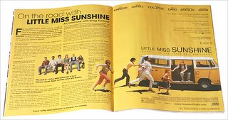
    The line separating editorial content and advertising in magazines blurs even more in the latest issue of Premiere, the movie magazine.
    Premiere's July/August 2006 issue features a doublespread ad for "Little Miss Sunshine," a new film from Fox Searchlight Pictures. The right-hand page contains the usual elements of a print ad for film. Under a small "paid advertisement" disclaimer, the left-hand page carries an interview with Greg Kinnear, one of the film's stars, conducted by Howard Karren, who is identified in the ad as a "film journalist." But what makes this 'paid advertisement' controversial is the fact that the magazine's masthead identifies Mr. Karren as a "contributing editor."

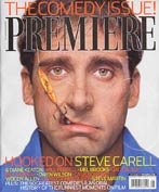
    The same issue also has Steve Carrell, another one of the film's stars, on the cover and inside there is a review of the same film that runs under an image from the film almost identical to one that runs in the middle of Mr. Karren's interview.
    Comments, anyone?

    Information source: Nytimes.com
    You can read the entire, unedited article here

    Labels:

    Friday, June 23, 2006

    Editorial: The Politics of Cover Pictures

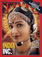
    US edition of Time, issue dated June 26 2006 , runs this topic on the cover: "INDIA INC.- Why the World's Biggest Democracy is the Next Great Economic Superpower- and What it Means for America." The cover image is a photo illustration of classical Indian dancer wearing a telephone operator headset.

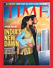
    Interestingly, the cover focus of June 18 2006 issue of Time (Asia/ India Edition) is also 'India'. But this time the cover models look radically different.

    Is this a case of how they like to see us in the West versus how we view ourselves?

    On a different note:
    Read an interesting web exlusive about how a relatively unknown face became the cover model of Time in the article "The Face of India"

    Labels:

    Wednesday, April 12, 2006

    Editorial: Deciding On A Magazine's Cover: Everyone Has A Different Take

    In the article "Cover Clinic: The Elements of a Big Seller" in Circulation Management (a magazine by the same group who publish Folio: ) Jane Zarem sums up the various ways consumer magazine publishers pick their cover subjects.
    Some magazines leave the decision almost entirely in the hands of the editorial staff, but most don't. The cover is such an overwhelmingly critical component of newsstand sales that many magazines invite executives from the circulation department(!!) into the final decision-making session. The reasoning is: They have the best handle on what will move product.

    Read on...
    http://www.circman.com/viewmedia.asp?prmMID=2175&prmID=1

    Labels: